
Your brand is the face (and voice) of your company. Think of it as a storefront. If your name, logo, and colors don’t speak to your target audience, no one’s going to walk in and buy all the great products you have on offer. So be it a grocery store, a clothing brand, or an app — your brand identity must be in sync with your company’s focus and core beliefs. However, the latter two aspects may change over the course of time — and that’s one of the reasons why you may want to look at rebranding your company. There are plenty of examples to take inspiration from, but the one that really stood out to me was Uber’s brand overhaul in 2018.
To say Uber has drastically changed the way the world commutes would be an understatement. Founded in 2010 with an aim to revolutionise the taxi industry, Uber allows users to book a cab via their phones, track their routes, and be informed of driver details. Sure, now it seems routine, but at the time, it was nothing less than remarkable.
Today, Uber is the highest valued tech IPO since Facebook and completes about 14 million trips per day. What’s interesting is though, that they’ve majorly overhauled their branding twice in their short history. So, what began as everyone’s ‘personal driver’ is now all about ‘moving forward’. In between, there have been ups, downs, and a whole lot of lessons in branding!
I’ll begin in 2014-16 — a not-so-great time for the Silicon Valley giant. Controversies about its treatment of drivers, safety policies, and toxic work culture had led to bans and a huge drop in public perception. The time was ripe for a fresh look at Uber’s branding. Unfortunately, this was an opportunity wasted. Their new logo, based on atoms and technology, just didn’t click, and they opted for different colors in each country of operation. And anyone knows that when it comes to branding, consistency is key.
Then came another slew of controversies — and a huge change in leadership. CEO Travis Kalanick stepped down and handed the reins to Dara Khosrowshahi, who was intent on driving home the point that Uber focuses on passenger safety and ease of use. And thus began their latest branding exercise.
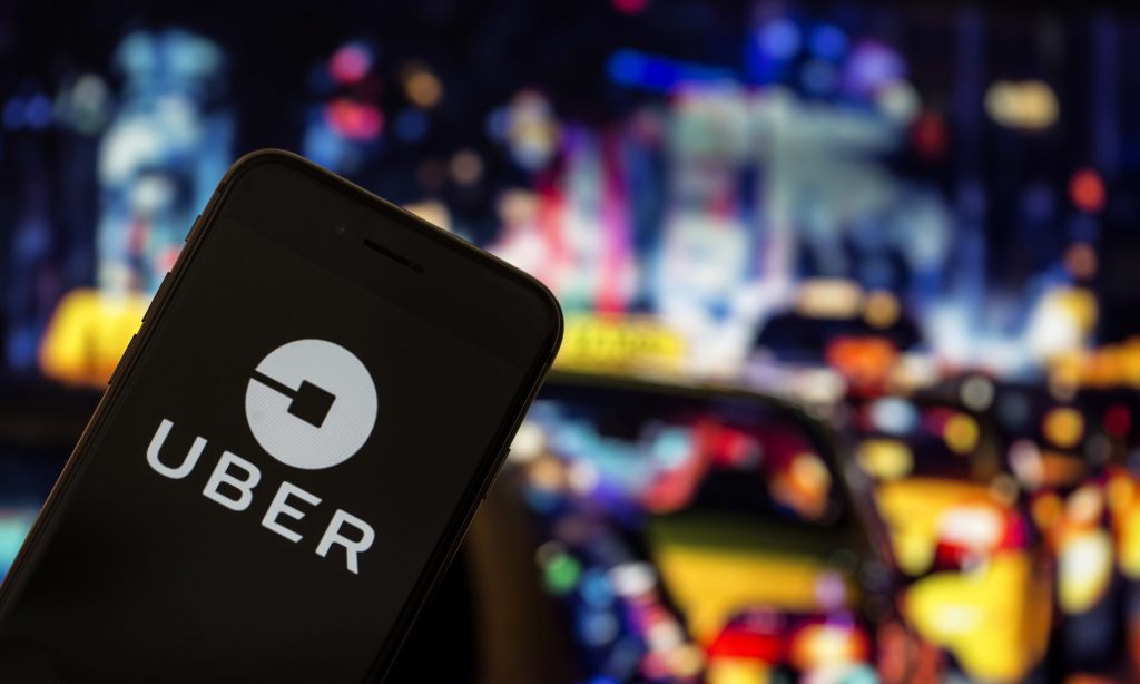
To do this, Uber hired global design consultancy Wolff Olins’ to give the startup a newer, simpler, more typographical look. By this time, the name Uber was known around the world, and the new name-based logo took that account.
The fresh logo was supplemented by creatives that included photos of people from around the world — serving two purposes. Firstly, it represents Uber’s global market, and secondly, adding this human element made the brand a whole lot more relatable. It’s no longer just a tech startup in faraway Silicon Valley — it’s also the drivers you meet every morning, the co-riders you pool with every evening.
What’s more, after the General Manager and Head of Cities at Uber, Fred Jones, admitted in 2017 that the company “didn’t really have a brand voice”, their latest rebranding effort establishes a distinct tone of voice. It’s been described as straightforward and easy to understand — reinforcing their new ‘audience-first’ focus.
While your brand may not need to move away from a tarnished legacy, there are multiple reasons you could look into refreshing your brand. And when you do, here are two major lessons you can take away from Uber’s journey.
First, listen to your users. Uber’s 2016 rebranding was met with widespread dissatisfaction — it was complicated and didn’t appeal to most people. And while rebranding twice in two years could seem like a mistake, the brand did the right thing considering the circumstances. Similarly, if customers are voicing not-so-great opinions on your branding, take note and do something about it. Next, keep it simple — map your customer journey for a chance to simplify and even eliminate steps i.e make your user’s life simpler. I know, seems obvious — but these tenets are often forgotten while brands scramble to rebrand after a scandal, new product launch, or leadership shakeup.
So, can your company pull off a successful rebranding just like Uber did? The answer is — absolutely!
Uber’s branding journey — A wild ride that ended in success
Tina Garg
Founder and CEO at Pink Lemonade, an Integrated Marketing & Communications agency in Bangalore. Tina launched the company in 2011, and today, it is known for its award-winning work in creative & business communications, and digital services. She comes with extensive experience in the creative industry, and is passionate about empowering women entrepreneurs.
READ MORE ARTICLES