Numbers have often been great proof points to support brand and corporate messages. So, data has always been part of the stories told in any communications campaign. In fact, great numbers have provided the proof of concept for any successful corporate initiative. It has been the bedrock of how we always identified story opportunities for PR campaigns. So, one wonders what the fuss about data storytelling is and why has it become a trendy tool that has given rise to sundry conversations.
Simply put, the difference is about being handed out a trend backed by numbers that makes for a good story Vs identifying a trend or a story to talk about by reading and interpreting the numbers that emerge from a survey or research that can be virtually about anything… hiring figures, sales, customer behavior, impact data et al
Gartner offers a useful perspective for content marketers: “Data stories explore and explain how and why data changes over time, usually through a series of linked visualisations. Although visualisation is almost always a key element in data stories, it is only one piece of a three-part strategy.” That three-part strategy, according to Gartner Senior Director Analyst James Richardson, includes the critical components of any good story-a beginning, middle, and end. “However, the end should never be a fixed event, but rather a set of options or questions to trigger an action from the audience.”
But this method of storytelling isn’t as simple as adding a few charts and graphs to illustrate a point. Instead, the data is the starting point, and the story emerges from there. Clearly this demands a new set of skills for communications professionals.
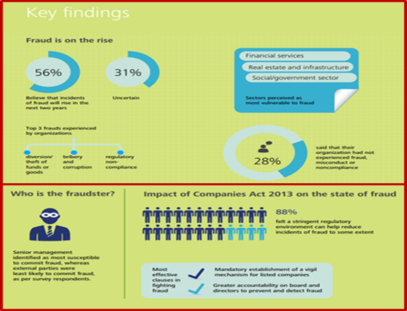
Here is a brilliant example of how Deloitte studied corporate governance in India. Particularly interesting was the executive summary. Here is a screen grab and you can find the full report here

Data storytelling frequently employs data visualisations, but it involves much more than presenting a graph. Data visualisation is often static: a chart may represent a single facet or a few layers of data. An advanced format can be an interactive dashboard where the viewer is free to experiment with different scenarios and reach their own conclusions. Whatever, it might be, it involves familiarity with some of the tools to enable you to come up with a narrative that these numbers can support.
One Sunday I decided to spend some time exploring what technology has to offer for storytellers like us who are neophytes as far as data analysis is concerned. The web search truly throws up some amazing tools that can help content marketers and storytellers. I fiddled around with some of them and came up with 3 such tools that I felt are easy to use and can be a DIY method of powering stories through data. Before, I recommend it is important to put out the disclaimer that there might be users with much more evolved skills and might have a differing set of views as far as data analysis is concerned.
But from the perspective of what can make for an easy and engaging read, I tried looking for enabling tools that can help create great Infographics, connected slideshows, impact reports and interactive data charts.
The top three tools I liked with a broad outline of what you can do with each tool…
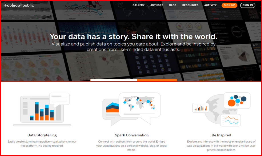
- Tableau Public
Tableau Public is a free online program that allows users to create visuals for storytelling. The primary goal was to make sharing data on the internet as easy as uploading videos. With Tableau Public, users can create interactive charts and graphs, stunning maps, live dashboards, and other visualisations.

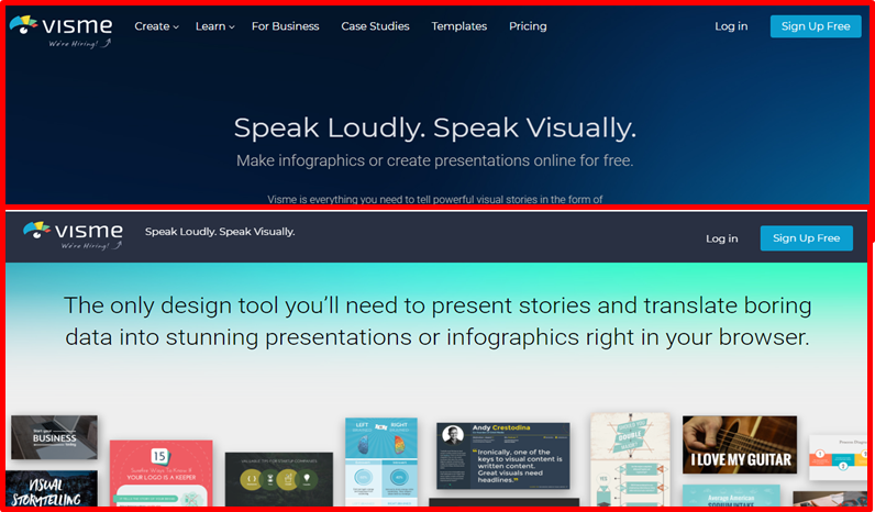
- Visme
Visme is an online tool for creating infographics, ebooks, presentations, reports, slideshows, banner ads and graphics for web content. There are others in the same ilk such as Canva and Piktochart

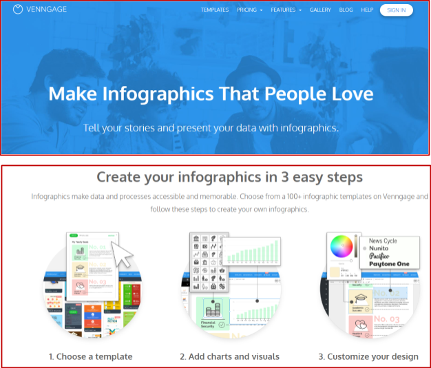
- Venngage
Venngage helps brands take their data and information and turn it into stunning and comprehensive graphics. They’re best for infographics, micrographics, and other data representing visualisations. The click-and-drag tool helps you easily generate data-driven visualisations in 3 easy steps: choose your template, import your data, and customise your design.

Data Storytellers are a fast evolving and growing community. It’s a smart combination of technical skills and a nose for narratives. As modern-day PR practitioners, you could do well by upskilling yourself to help write a better pitch and manage your social feeds more ingeniously
The views and opinions published here belong to the author and do not necessarily reflect the views and opinions of the publisher.


Be the first to comment on "A case for numbers – how boring numbers can reveal wonderful stories"