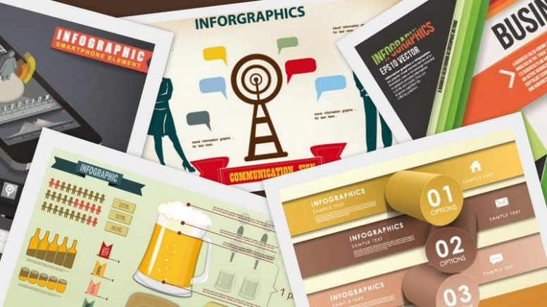
With the rise of digital and social media share in the PR mandate several new tools have come to play an important role in public relations. Infographics aka data-viz is one such important medium that’s being used much more effectively by the present day communicators than ever before. We list the top seven tips to remember while creating and using infographics for PR.
What’s the News?
As any other story pitch the idea of an infographic must start with a story peg. Surf through the data and find out what all is worth a story? Do remember, boring data will result in an even boring infographic and that’s something which has no takers. A boring visual is the last thing to find space and mileage. Finding the right story and giving it the best of the titles is like half the job done.
Show More, Tell Little
Most important of all things to remember is that infographics are visual mediums. It’s almost a picture and as they say that a picture speaks a thousand words, so should the visuals on infographic and not the text on it. The very base of infographic is data visualisation and that’s why the other name for infographics is data viz.
Avoid Graphs and Charts
It may sound absurd in the first instance but give it a thought and you would agree no less. Infographics are not what graphs and pie charts are. They are way different. They are all about visual representation with much creativity involved. Let loose your imagination and employ as many design tools as possible to create an infographic. Double check before considering it to be done – how different is it from a graph or chart?
Create Heirarchy
All great infographics start with a ‘start’ figure. That’s what the news is all about. Think of it as a hard hitting headline. Make it as prominent and attractive as possible. Rest of the data is like the build-up of the story. All of it is there only to tell what went into the making of the story, the path, milestones, tools, etc. One should aim that the all the supporting figures lead to the main story, the ‘star’ figure.
TG Check
Another basic to remember always is, who is being targeted? If you haven’t thought of a particular target group do narrow down to one and proceed. That’s the best way. Not all visuals appeal to everybody. What would be much appreciated by one segment may not find any taker in the other segment. Once you have your TG sorted, picking designs, colours, elements and themes will be much easier.
Typography Has Its Role
No, I am not contradicting myself here. Yes, infographics is all about visualisation but the typography comes in play with titles and data. That’s another part that is sometimes missed in creativity and hence the frame looses that extra bit of polish that otherwise makes it glitter all the more.
Rule of Three
That’s a designing rule which is advised to be followed while sketching an infographic. It’s all about the colour palette that should be employed and worked within. Going wild with colours may bar the visual flow and hamper the very purpose of creating an infographic. Choosing a palette that doesn’t attack senses is a good thing to do. That’s where the rule of three helps and makes the colour selection job easy. Choose three primary colours. The lighter shades makes for the background and other two may break up the sections. If more colours are required to play with, shades of the three main colours can be used. It keeps the palette cohesive and soothing, rather than too jazzy and jarring.


Be the first to comment on "Infographics in PR: SEVEN Tips to Remember"