A few months ago I wrote a piece titled ‘Five ways to fight webinar fatigue’ , an excerpt of which read “Mr. Bluebeard reminded me that less is more: A cup that is full to the brim is difficult to drink from. So too is a webinar or any screen based session that is packed full of content. I was reminded that in these times of screen fatigue ‘less is more’. Less content ensures more time to engage with it. The hard work is to really figure out what I want to share with my audience.”
(The full piece, bit.ly/RTLeftBrainRightBrain37, in case you are interested.)
I decide to put theory into practice and am happy to report that three things worked really well.
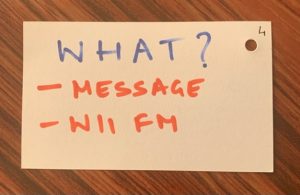
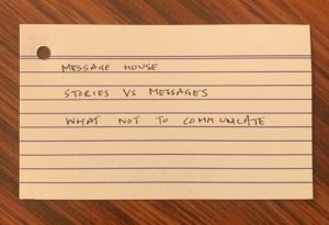
1. Cue cards instead of a PowerPoint presentation
2. A good old fashioned white board and some markers and
3. Standing instead of sitting.
Armed with clarity of what I wanted to leave behind with the students, a two hour class to wrap up the PR semester for Delhi School of Communication, challenged me to incorporate all the learnings and try them out firsthand.
The ask was pretty straight forward “Sir I would like you to conduct the last class of this semester. Can you take a comprehensive PR campaign class next week… 2 hour closing session? It would be great if you could use a case study.” I had tried once before negotiating the class duration down to one hour, and failed. So I knew the brief was set in stone. It had to be done and I had to find a way to hold their interest and keep the class engaged for 120 minutes.
Standing changes so much: The energy is different, there is freedom of movement and this changes the delivery. Also, I feel the amount of effort I put in to prepare, find a space that allowed me to do this standing and do a test run, all added up to making it not just another class. I wanted to make it special, and that intention informed my choices.
Hand written Cue Cards vs. a PPT: I really had to think hard about what I wanted the key takeaways to be. This once again ensured a different level of preparation and a lot of thought and effort being put into “what’s in it for me if I am a student listening to this guy, the good old WII FM principle”. The other thing about not having a presentation is more face time and presence, it’s you, not the slides that hold attention.
Last little tip I can share is the back of the cue cards are a brilliant place to jot down a few key points that you want to talk about.


A white board and markers: Brings some sense of “the class we knew” and I believe we are all craving for a little bit of the way things used to be. It allowed for some spontaneity and allowed me to recreate the classroom we knew.
I had kept a chair on standby just in case I got tired standing for two hours at a stretch. I am happy to share that I forgot all about it. It was truly an enjoyable experience stretching myself beyond the comfort zone of my lazy boy chair and a well packaged ppt.
Stand up, show up and stand out. When I asked for feedback on behalf of the students, the message was loud and clear “It was different and interesting… like an actual class”. I will end on that note, happy to know the class of 2020 are well on their way to finding their way forward, and we teachers are finding our feet too.
The views and opinions published here belong to the author and do not necessarily reflect the views and opinions of the publisher.


Be the first to comment on "What a few cue cards, a white board and two hours of standing taught me"